
Applications today, offer numerous features and functionality that fulfil our requirements. However, have you ever looked at them closely and observed their layout or navigation, apart from features? Mobile app navigation plays a crucial role in the existence and use of an application.
If your app offers a wide range of features but if users cannot navigate through it smoothly, then it will fail to impress them. Also, users will immediately uninstall your application if they find it uncomfortable with the navigation.
It means that even when the design is responsive and excellent in style, the mobile app navigation has to remain fully functional. Moreover, the app should have a smooth interface, including well-incorporated animation, custom icons, and clear content. Additionally, it should have the potential of serving iOS and Android platforms.
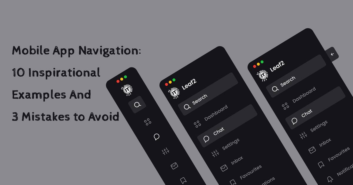
There are different kinds of mobile app navigation that you can incorporate while designing your app; side menu, hamburger menu, mobile menu UI layout, and others. Let us take a look at look at a few mobile menu examples or mobile app navigation inspirations.
A navigation menu represents a list of features or categories, which include a set of icons or links assembled. It offers clear visibility in terms of design that is different from the rest of the page layout. A navigation menu primarily consists of hamburger menus or navigation bars. However, it may contain several other things apart from the ones we mentioned here.

As the name suggests, the sidebar menu offers layout navigation, wherein there are icons related to the menus mentioned in the app. When you want to go to a specific menu, you only have to tap the icon, and it will lead you to the desired place.
Source : Nicholas Ergemla

The app represents items related to clothing, footwear, knitwear, and more. The best thing about the menu navigation is its rotating screen. It consists of a menu that can be rotated horizontally. When you tap one of the main menus, then it will rotate horizontally and open up with the sub-menus.
Source : Olga Lopatina

The food app menu shows the simple menu navigation that displays food items with their respective icons. So, the user can tap on any desired menu to order it.
Source : App Innovation

The full-screen app eliminates the boredom of having half screen menus. Yes, you read that right. It offers to have full-screen menus. The image below shows how it will look when you tap a menu on this app.
Source : CMARIXTechnoLabs

Usually, all app menus have the default design and layouts, offering the same functionality. It means that you cannot customize the menu as you desire. However, the personal menu app helps you place your desired menu icons with the drag-and-drop functionality.
Source : Ranjith Manoharan

As the name suggests, the minimal stocks app offers a simple menu layout that leads you to the desired place with a single tap on the menu.
Source : Sandeep Gajula

In the images below, you can see that this app offers a menu layout with animation. It enhances the user experience.
Source : Eugene Zaretskiy

The banking app offers simple menu navigation, wherein if you tap on a menu, it will provide all the information included therein.
Source : Jona

Many apps and designs we see today, do not offer labels related to the tab icons. The playfh com login app offers the functionality at a glance to users, wherein the user can view labels along with their tab icons with an animation.
Source : Ranjith Manoharan

The MGM Resorts App offers interacting with a menu with the help of animation. The picture above gives you clear visibility in this direction.
Source : Superformula
There are quite a lot of things that you can incorporate into your app navigation to enhance your user experience (UX). However, it is significant that your user should not get lost while navigating through your mobile application before they start.
Offering lots of features and functionality to users may sound great; however, make sure you do not confuse them by leaving them to assume what to do next. You cannot retain your users based on guesswork when it comes to navigating through the mobile application.
Cramming too many options on a single page may complicate things for your users while navigating. As a result, while choosing too many options, they are likely to miss the key information that you intend to communicate.
Hence, while designing the app navigation, limit the options to between five and seven. It will make it easier for users to scan their options to make a quick decision.
It is universal to app icons that the house icon will take you to the home page, and clicking the cart icon will provide details of your order. Therefore, when you break these golden rules of navigation, then your users are left confused.
As many users like to have an organized appearance in their apps, you may think of hiding certain navigation menus behind another tap. However, it will make no difference to the user experience. Hidden navigation will only frustrate your users, which will result in abandoning your app immediately.
Thus, if you try to assemble too many options for each category to minimize the design, users will get confused about what to choose first. On the other hand, fewer options will also not work.
When users are accessing your app, they should not need to work to find their way around the application. For example, if it takes them more than two to three clicks to get what they are finding, then it is high time to restructure the process.
It may feel essential to hide certain menus to make the app look neat with limited space. However, they will make users go lost and prevent them from finding what they need because of multiple clicks or taps.
Since the emergence of mobile and web applications, we have been interacting with the key navigation elements in particular places. Therefore, there have been standard places for each of them. However, there has to be a balance between too many and too few options. It becomes challenging for users to find their desired stuff if this balance is interrupted.
Imagine users clicking or tapping on the menu and having their whole screen occupied with menu options. It happens that they feel that they thought they knew where they wanted to go, but now they are lost and not so sure.
Therefore, there has to be a perfect balance between too many and too few menu options when it comes to designing the navigation. At the end of the day, it will either frustrate your users or make them happy about navigating through your app.
It may seem overwhelming to increase the path of navigation, but people should not be finding their way around your app. If they have to go for more clicks to find what they have been looking for, then you have to streamline the entire procedure.
For instance, while using a banking app, users should be able to view their account balance or history at one tap or click.
As we discussed above, your mobile app navigation should not be complicated for users to feel lost. They should be guided well while navigating through your application. It means that your app should provide proper indicators to make them find their way to what they have been looking for without confusing them or making them feel lost.
Due to several reasons, your app might become slow in responding to a user’s request. So, there have to be progress indicators to provide them with proper information in this direction. They should be informed correctly regarding what is going on with the app.
When you provide them with feedback about the slow progress of the app, they are assured and won’t have to play any guessing games. Moreover, it will reassure them about how far they need to go, and how long it might take them to get there.
Imagine a user, in the middle of a task on your app finds his screen freeze. In this case, it will frustrate users if they keep on tapping or clicking the menu again and again and get no results. Therefore, it is significant to provide feedback if the app does not meet the expected response times. You can achieve this by incorporating feedback functionality in your app.
When you are dealing with a mobile or web application, confirmation messages play a vital role. For example, Save and Delete are the actions wherein confirmation is needed from the user. Therefore, designers frequently put them near each other, as they are related. However, if you put them too close to each other, it will likely lead the user to make the wrong selection. Thus, confirmation actions play a vital role in this scenario.
Primarily, confirmation actions ask users to verify an action like proceeding with or canceling an act. However, make sure you do not overuse these actions and instigate your users for actions that can be easily reversed.
When you plan to design your app navigation, make sure to establish the best approach for your user. For this purpose, you can conduct a market survey about how they use apps of your type and also take a look at the existing ones on the market.
It is good to utilize all components to meet the expected criteria of the app navigation. However, you need to be careful while structuring each of them in the layout.


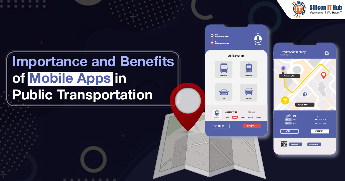
In this post we will see that how mobile app development has helped public transport and we will also some importance and top benefits of dedicated a...

Discover various methods of mobile app monetization and how mobile application development services providers can assist in crafting effective strateg...

Explore key features of Gen-Z apps and the UX design approach you need to know for engaging this tech-savvy generation effectively. Stay ahead in app ...
Request a Quote


Book a Meeting